Today’s Type Tip: “O” Boy!
I have a confession to make: I’m in love with letters. Not in the cool, romantic way literature buffs and poets love letters; but in the dorky, glasses sliding down nose, masking tape stuck to chin, graphic designer’s way. And I’m on a mission to share that love with you.
Initially I had grand plans to do this in a somewhat organized way, but that’s no fun, so I’m starting with one of my faves: The One, the Only, the circle of life herself…
O. (No, not Oprah.)
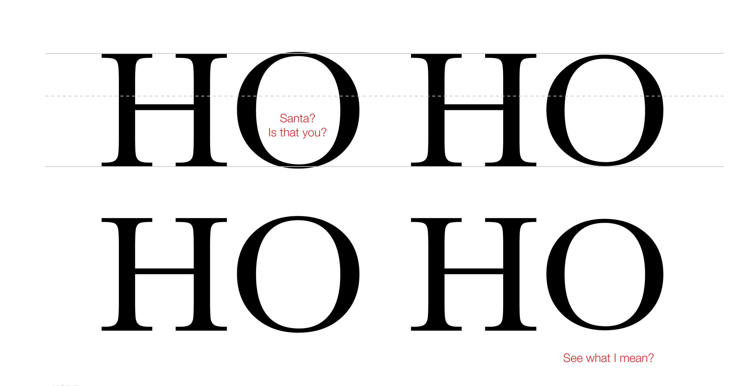
Did you know some capital letters are taller than others? Rounded capital letters, such as O and C, may extend just above the cap height (illustrated below as the line across the top of the letter “H”) and just below the baseline. If they didn’t do that, it would cause an optical illusion where the O would appear to be smaller than the other letters, and that would just look funny.

Pretty cool, huh? Now you have something interesting/relatively useless to tell your friends. Think of how much fun you’ll be at parties!
Alright, see you next time for more type tips and other such nonsense.
