Tuesday’s Type Tip: Tracking vs. Kerning
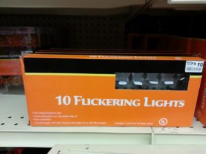
 I recently came across a photo which perfectly highlights why spacing is so important to the art of typography. When “flicker” becomes “fucker,” you know someone got fired. This example reminded me of a post I wrote in 2011 about tracking and kerning. It’s a pretty dry subject, but reading this article may save your job someday.
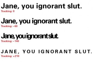
Tracking is the drunk sorority girl of typography, with the paradoxical ability to be either dense or spacey.
It’s not that tracking and kerning have it out for each other; they’re just different breeds of the same species. While kerning refers to the adjustment of space between two specific letters, tracking deals with space between multiple letters in a word, line or paragraph of text.
 Tracking is the drunk sorority girl of typography, with the paradoxical ability to be either dense or spacey. It can change the look and legibility of a block of text or create graphic impact for a specific word or headline. Tracking covers a lot of ground and usually won’t barf on your shoes at the end of the evening.

Occasionally tracking is used to squeeze more characters onto a line of type, but I recommend against using it for this purpose. Side effects may include clumsy text flow, unusual hyphenation, awkward spacing and dry eye.
“Kern” is A Four Letter Word
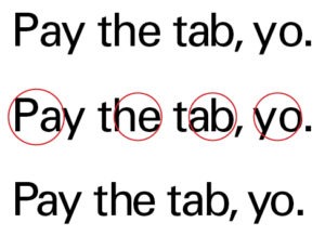
While tracking is more popular and easy to do (see “drunk sorority girl”); kerning is like a surgeon, only with more friends and better social skills. A refined and delicate process, kerning is the adjustment of space between pairs of letters. Certain letter combinations tend to create awkward spacing, especially when viewed at larger sizes, like headlines or signage. Special care making these fine adjustments leads to smooth readability and makes your design look more professional.

The first line in the sample above was typed without any adjustment to letter spacing. I’ve circled a few pairs of letters I felt needed kerning. Do you see the difference between the top and bottom versions of the sentence? If so, congratulations, you’ve learned a new skill! If not, maybe you should consider medical school.
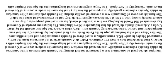
The goal of both tracking and kerning is to make text appear even in tone. If you look at a page of text from far away (or better yet, upside down), it should appear as even, gray texture. Awkward spacing stands out when you look at type as shape and texture rather than letters and words. Flipping text allows us to see it as a graphic element, rather than something to be read.

To a designer, reading can be a distraction, which is why you should never ask one to edit your brochure.
It takes time to become proficient at a subjective art such as typography, but even a novice can benefit from the use of tracking and kerning. It’s sure to make your design look more polished and professional, and it might just save your job someday.

